*Makes your web page look good on all devices. *Uses only HTML and CSS. *Is not a program or a JavaScript.
What Is Mobile Responsive Design? When a website is responsive, the layout and/or content responds or adapts based on the size of screen they are presented on. A responsive website automatically changes to fit the device you’re reading it on.
What is Responsive Web Design? Responsive Web Design is about using HTML and CSS to automatically resize, hide, shrink, or enlarge, a website, to make it look good on all devices (desktops, tablets, and phones).
Adaptive design refers to graphical user interface (GUI) design that adapts to different screen sizes. Designers apply it in GUIs, such as webpages, which must function on devices of different sizes.
Conclusion: In my opinion the adaptive design is much better, because it’s optimized for each device to get the best experience. On other hand it takes much more time than the RWD. Both of them have own pros and cons.
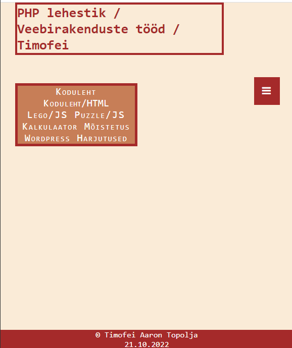
Example: (Responsive Web Design)
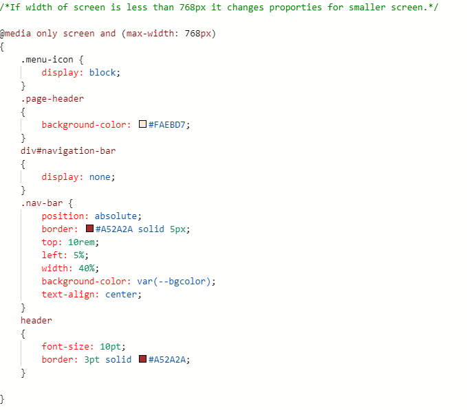
Pc version of my site.Mobile version of my site. Clicking on menu button opens and hides the menu.